You seriously won't even recognize Twitter after this.
Twitter has launched a major redesign, their first in years and it seems the app is finally starting to listen to what users are looking for — starting to being the keywords.
We had a little bit of a #TwitterFail earlier in the day. Here at Gadget Hacks, we decided to go on Twitter and live stream a before and after of the new redesign. Unfortunately, things got a little crazy, as my phone didn't update to the full redesign. This seems to be an issue that multiple people have run into, where the app says that it's given you the full update, but in actuality, it has only updated the fonts. Take a look at some of the user responses to this issue below and watch me fail at trying to update my own account.
Luckily, in the next video, you can watch resident Gadget Hacks writer and gamer expert, Jake Peterson, get it right. He was able to get the update up and running and we were able to check out some of the cool new features.
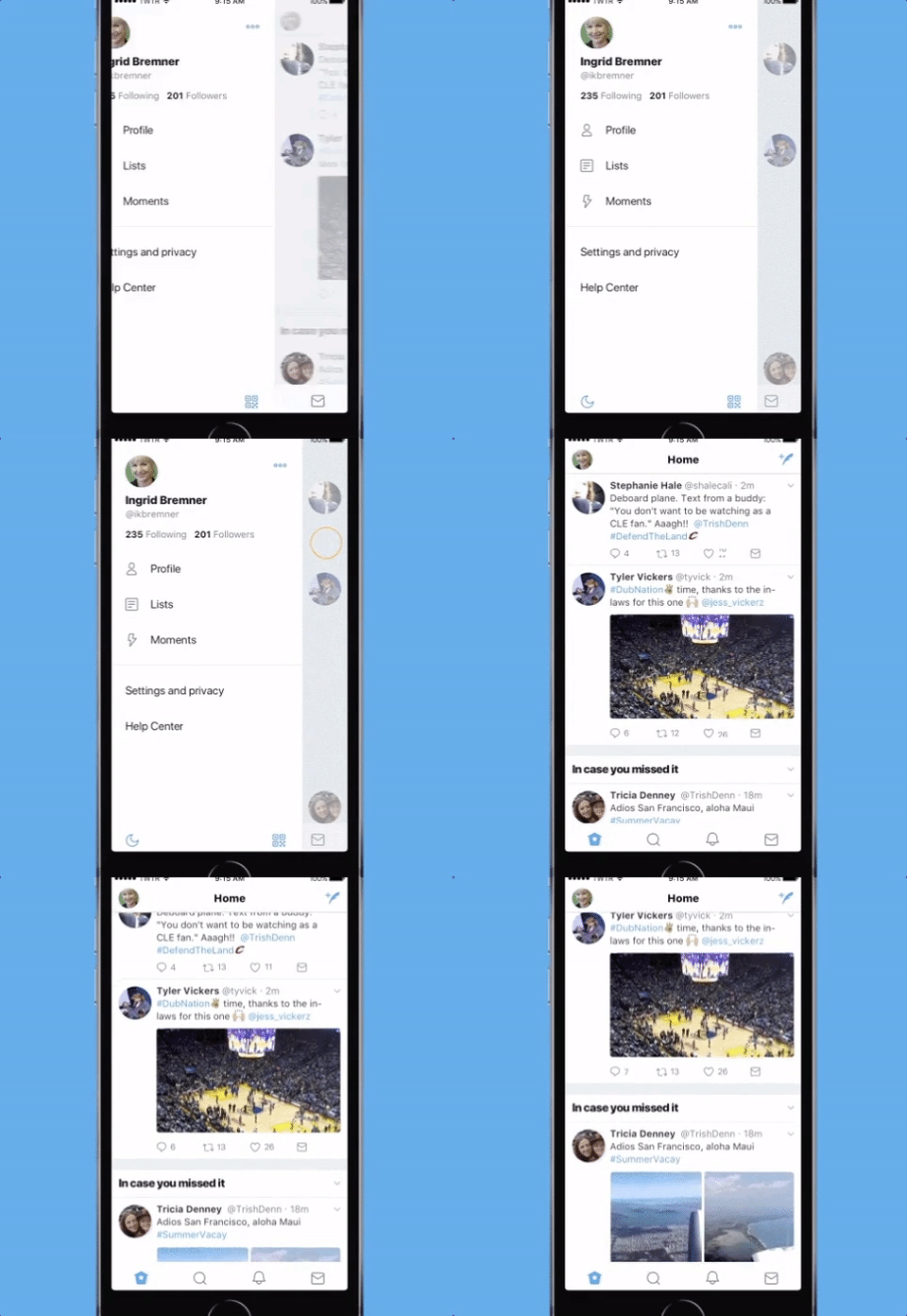
The biggest change we saw was that all your user options are now located in one tab. Twitter calls this the "side navigation menu" and with it you can find your profile, additional accounts, settings, and privacy. This had been available to Androids for a while but is now being offered to the new iOS. This also eliminates one of the icons at the bottom of the screen, bringing it now to four instead of five icons. Oh, and by the way the five icons are completely different now.
This is apparently because the arrow that had been for the "reply" tweet confused users, making them think it was the button to go back or delete a tweet. Now you can respond using a more conversational icon, a speech bubble.
On their blog, Twitter wrote:
"You told us you loved this change on Android last year and we're excited to now bring it to iOS"
As Jake says in our live video, the new design definitely reflects the new iOS. The profile pictures are bubbles rather than squares, giving the layout a lighter, airy feel. The font has changed as well. Twitter has made their font bolder so that @ names and mentions definitely stand out. Not to mention, you won't have to swipe down to update and see how many likes and retweets a tweet has anymore. The new redesign allows instantly updates how a tweet is doing, no swiping involved.
All of this is part of Twitter finally figuring out what kind of platform they are. It seems Twitter is finally realizing that it might be more than a social media app, that it's actually transforming into a platform for writers, artists, and politicians to work. A cleaned up version of their old setup definitely reflects that.
For the most part, the response from Twitter users has been surprisingly negative. Many wishing that they were one of the few who couldn't get the update.
Twitter might have said they have started to listen to their users, but the overwhelmingly negative response seems to say that the users are looking for other things. (Hint, hint: an edit button. Please!).
Check out the Twitter live videos at @GadgetHax on Twitter and sound off in the comments if your Twitter update isn't working or how you feel about it overall.
- Follow Gadget Hacks on Facebook, Twitter, Google+, and YouTube
- Follow WonderHowTo on Facebook, Twitter, Pinterest, and Google+
Cover image by Freestocks.orgs/Stocksnap.io




Comments
Be the first, drop a comment!